Overview
Signups that never finished setup
Customers live during the redesign
Kickoff to a signed-off product system
Entry plan, repriced around the product
Client
PixelFlow
Industry
Meta conversion tracking
Services
Product design · Onboarding UX · Design system · UX writing
Timeline
2026 · 4 months
The challenge
PixelFlow was built by engineers for marketers, and the product still spoke the wrong language.
Around 40% of signups never finished setup, and the customers who did get through were reading labels that described the system rather than what would happen.
None of it could be fixed on a blank page. Two hundred paying customers were using the product while we redesigned it.
Setup lost two in five
Roughly 40% of signups never completed onboarding.
Language built for engineers
Labels described the system, not the outcome.
Value you couldn’t see
Customers paid to fix something invisible, with no proof it worked.
A live product, not a blank page
200+ paying customers meant nothing could break in transit.
Before and after
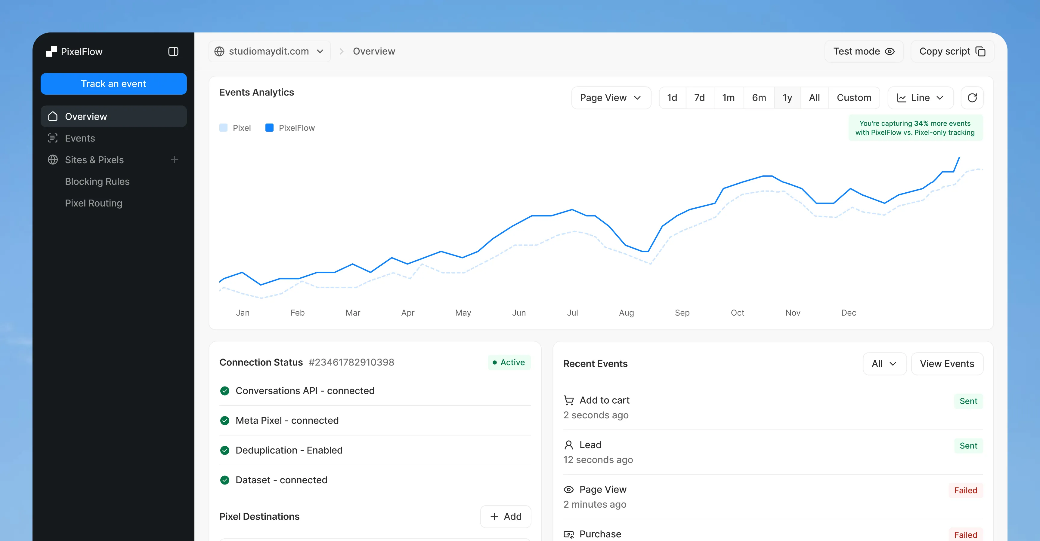
The old overview opened with two warnings and an empty chart. The new one opens with the number customers came for.
How it started
Emmett came to us with a number, not a problem.
Around 40% of signups never finished setup. That is a metric, so before touching a screen we asked what those people were actually doing. He went back through session playbacks and customer calls and returned with five reasons: no time, it looked complex, wanting to see the dashboard first, wanting to check the pricing, and wanting to be sure nothing would break.
Only one of those is a flow problem. The other four are confidence problems — and that changed what we were being asked to design.
Two onboardings, then evidence
We built both versions instead of arguing about one.
Version A broke setup into granular steps; Version B collapsed it into two. Both were clickable by day two, and we proposed split-testing them against live signups rather than picking on taste.
The team chose the simpler flow. We kept the granularity where it earned its keep: on the longest step, fields reveal one at a time, so nobody meets the whole form at once.
The hardest screen
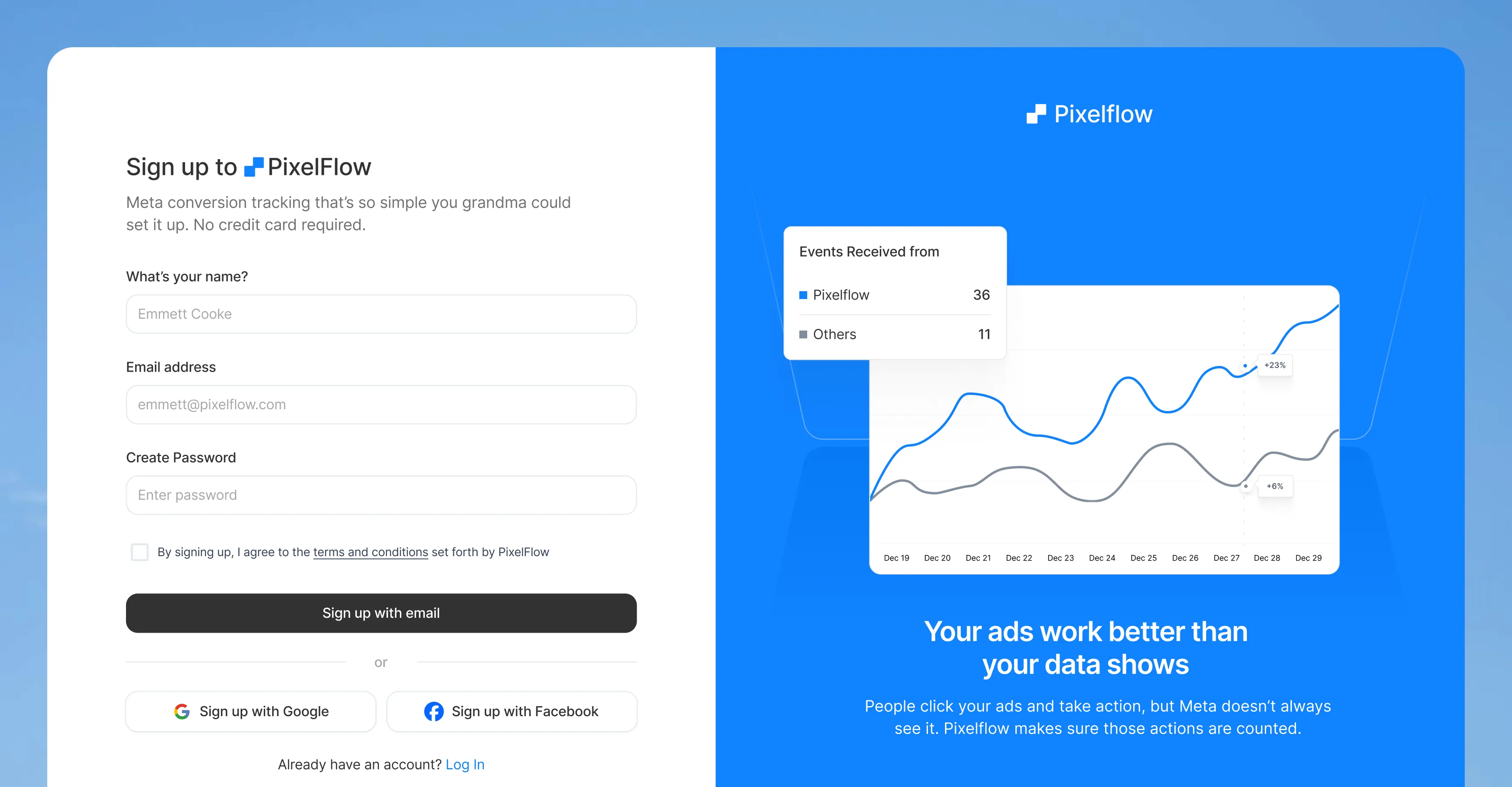
Connecting Meta is the one genuinely technical thing a non-technical customer has to do.
It means digging a Dataset ID and a Conversions API token out of Meta’s own Events Manager. We moved the instructions onto the screen instead of into a help doc, collapsed behind “Where to find this?” so the page still reads short.
The subtitle carries the reassurance: “We’ll guide you step by step. You can’t break anything here.” Elsewhere, “Connect Facebook Account” became “Login with Facebook” — customers were worried we would start posting on their behalf.
Designing around a constraint
We wanted to fire the verification event for people. The product wouldn’t let us.
PixelFlow’s own bot protection correctly blocks headless traffic, and a browser will not open a tab without stealing focus. So we designed for the constraint instead of fighting it: a 30-second progress bar so the wait is named, and “Not working? Try these steps” sitting underneath it.
Product language
Almost every label in the product described the system that produced it.
PixelFlow sells to marketers running Facebook ads, not to data engineers. We replaced the labels with ones that describe what happens. Nothing about the system changed; what people believed about it did.
Proving the value
A tracking tool’s hardest job is proving it’s working.
Customers pay PixelFlow to fix something they can’t see, so every widget on the overview answers one of two questions: is this good or bad for me, and can I do anything about it?
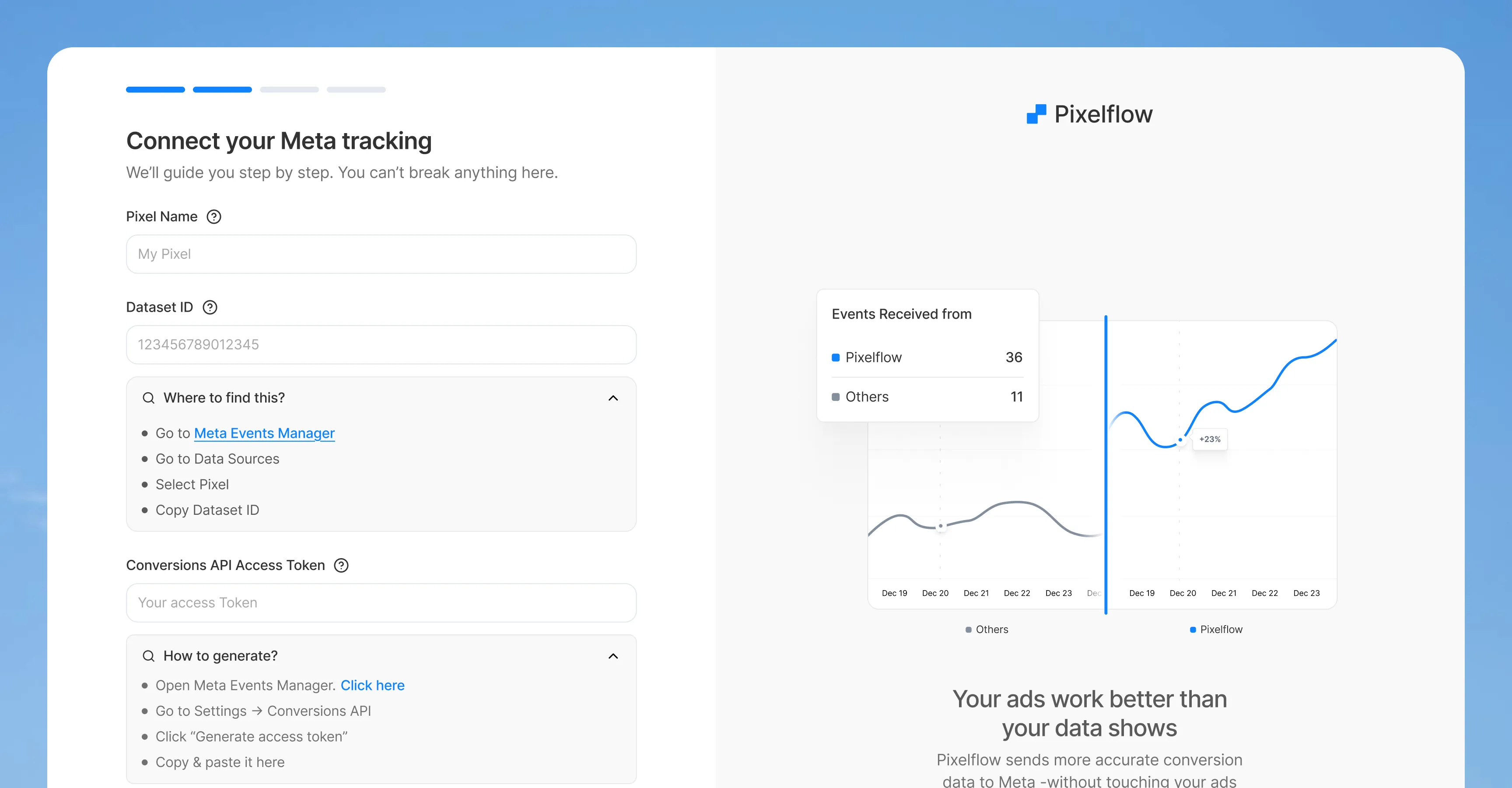
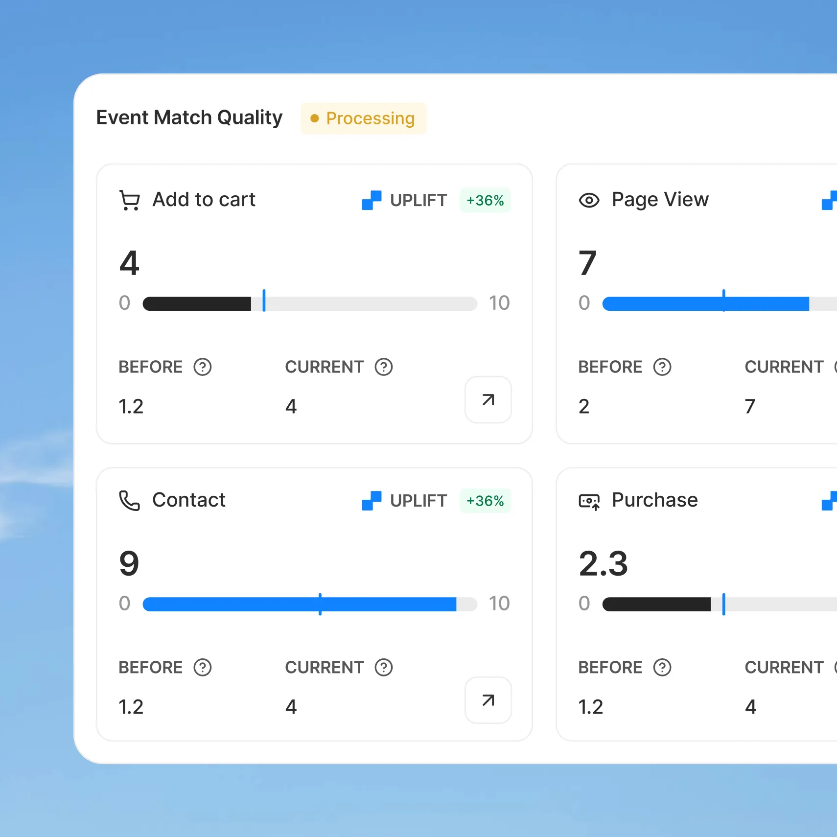
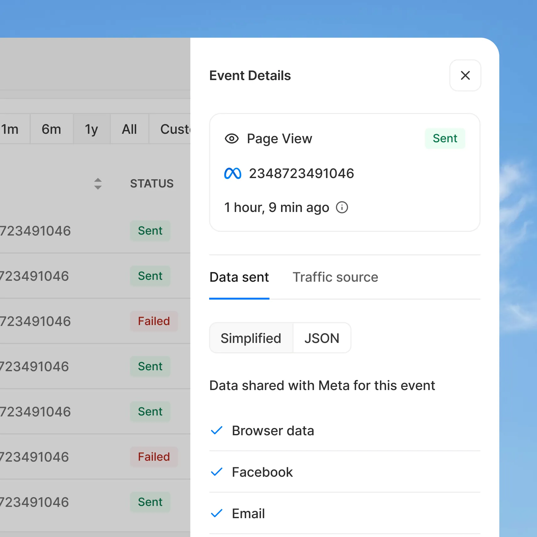
Event Match Quality shows the score before PixelFlow next to the score today, and says out loud when a score can’t go higher — a PageView will never reach 10/10. On the chart, browser-side events run as a dotted line beneath server-side ones, so the gap PixelFlow closes is the shape of the graph rather than a claim in a tooltip.
The rest of the product
Three rules let the rest of the surface build itself.
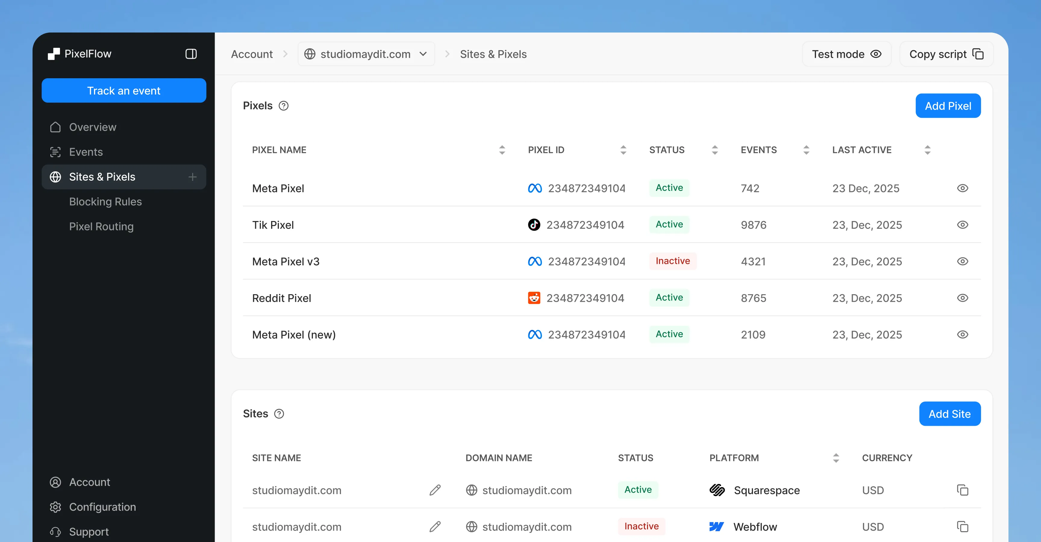
Sidecards inspect, modals act — one rule ended a month of case-by-case debate. Complexity earns its place, so blocking rules moved off the overview into their own page because around 90% of customers never touch them.
And filters people can guess: the old advanced filter was powerful and unused, so it became three dropdowns — source, event type, status — with the power kept in a tab underneath.
A themed design system
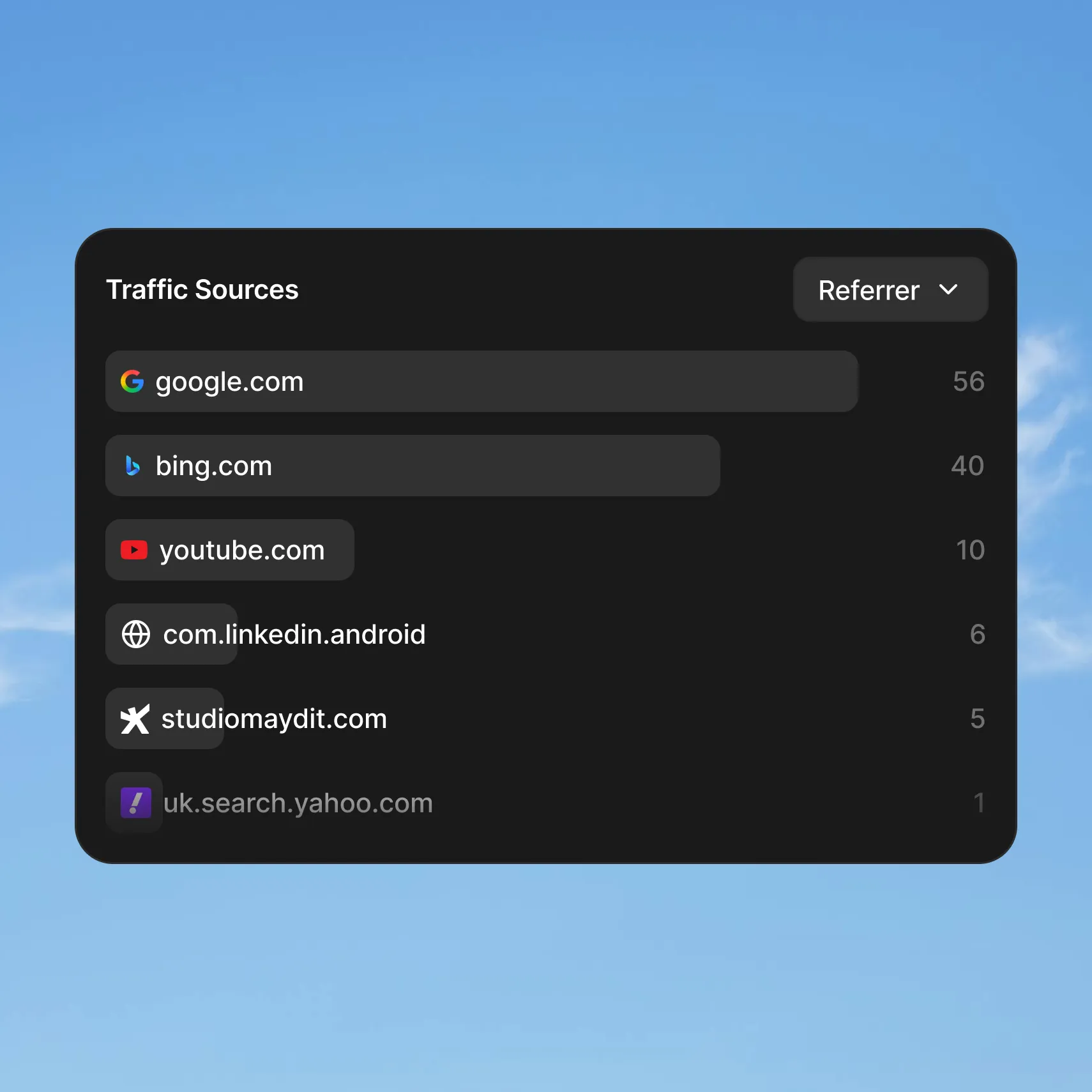
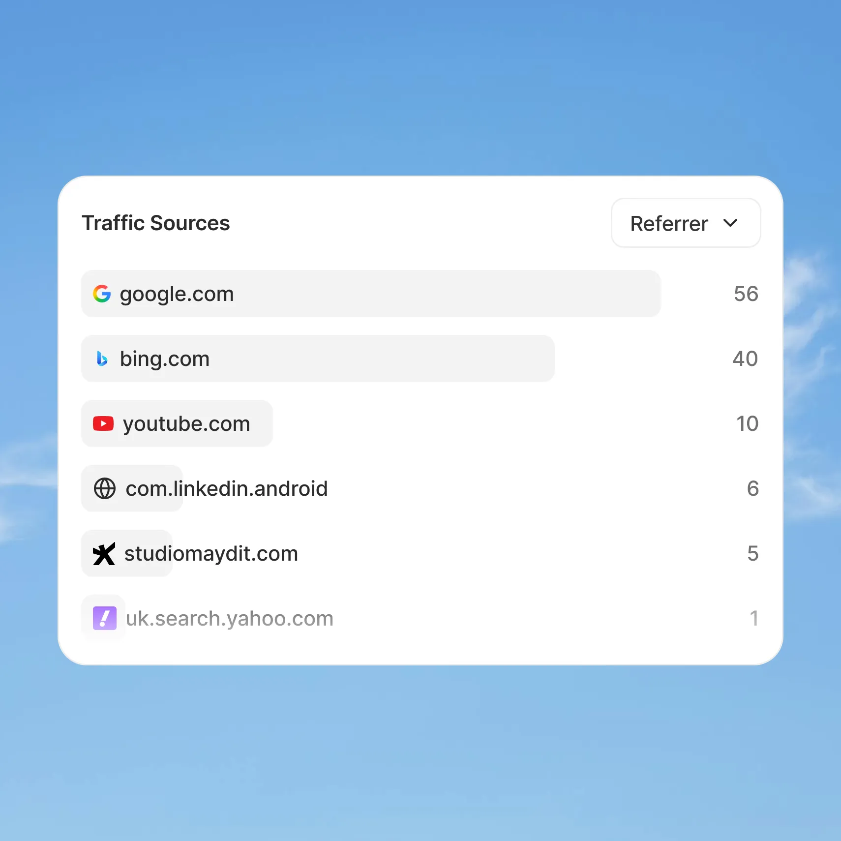
Light and dark are one set of colour variables, not two designs.
Colour variables and text styles came before the screens, which is why the second theme cost days instead of weeks — and why one engineer could build the whole product from the file.
How we worked
Async, in public, with the right to disagree.
One Slack channel, one Figma file, one Notion board — end-of-day handoffs from us, Looms and session recordings back. PixelFlow’s engineer reviewed flows for edge cases before we finished them, which is why constraints surfaced during design rather than at handoff.
Asked to redesign every table in the product, we said no: the existing ones worked and extra padding would have crowded the data. Asked whether Sites should be the parent of the architecture, we argued that it should, then changed our minds when the founder pointed out that pixels outlive sites.
The result
A product a marketer can set up alone, and prove is working.
A two-step onboarding built around the five reasons people were leaving. Every core surface redesigned with its states and edge cases specified. A vocabulary rewritten for the people who buy it, and a themed system handed to a single engineer.
PixelFlow moved its entry plan from $19 to $29 and re-tiered around the new product. Then they asked us to redesign the marketing site too.
200+
Customers on the live product
7
Core surfaces redesigned
5
Drop-off reasons designed against
2
Themes from one token set
$19 → $29
Entry plan repricing
4 months
Product, then the website
Next
The product work turned into the website
Read the website case study