Confirmation Screen UI Patterns for SaaS Products
Confirmation screens appear after an action is completed. A form is submitted, a call is booked, a payment goes through, or a setup step is finished. Because the action is already done, confirmation screens are often treated as an afterthought. In practice, they play a critical role in setting expectations, reducing anxiety, and guiding users toward what happens next. This article covers common confirmation screen UI patterns used in SaaS products and when each pattern is most effective.
Confirmation screens appear after an action is completed. A form is submitted, a call is booked, a payment goes through, or a setup step is finished.
Because the action is already done, confirmation screens are often treated as an afterthought. In practice, they play a critical role in setting expectations, reducing anxiety, and guiding users toward what happens next.
This article breaks down common confirmation screen UI patterns used in SaaS products and explains when each pattern works best.
Simple confirmation with clear status
This is the most basic confirmation pattern. It reassures the user that their action was successful.
It usually includes a short confirmation message, a visual indicator such as a checkmark, and very little additional content. This pattern works best when no follow-up action is required and the user can safely move on.

Confirmation with next steps
Some actions require follow-up. In these cases, confirmation screens should clearly explain what happens next.
This pattern is useful when there is a delay before the next interaction, when users are waiting on an email or invite, or when setting expectations helps prevent confusion. Clear next steps reduce uncertainty and drop-off.
Confirmation with context and reassurance
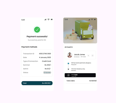
Certain actions feel high-stakes. Payments, cancellations, account changes, or data deletion can create anxiety.
This pattern focuses on reassurance by restating what just happened, confirming that no further action is required, and explaining what to do if something feels wrong. It is especially important in billing and account-related flows.
Confirmation with calendar or external actions
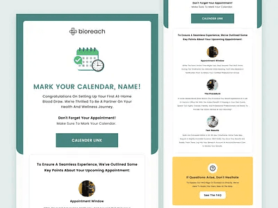
When the next step happens outside the product, confirmation screens should help users bridge that gap.
This includes actions like adding a meeting to a calendar, waiting for a follow-up email, or joining a call later. Making these actions obvious reduces missed steps and no-shows.
Confirmation with supporting content
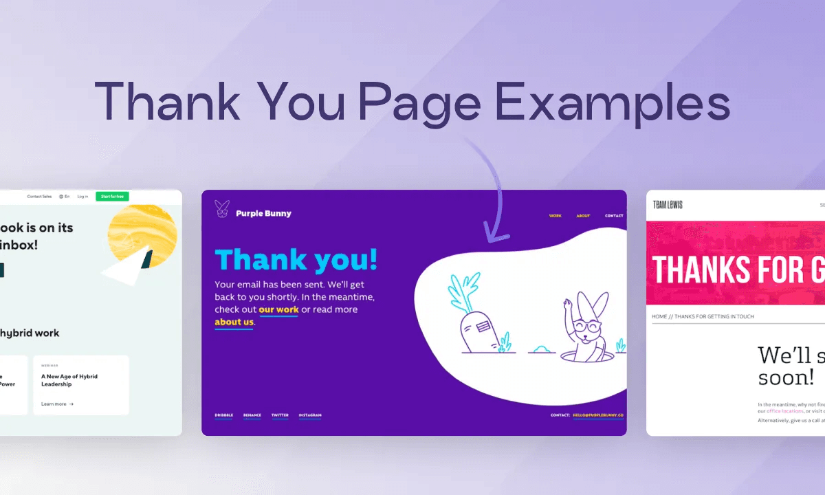
Sometimes confirmation screens are an opportunity to provide lightweight supporting information.
This might include a short explainer, a brief video, or links to helpful resources. The key is restraint. Supporting content should add clarity, not distract from the confirmation itself.
Confirmation with return paths
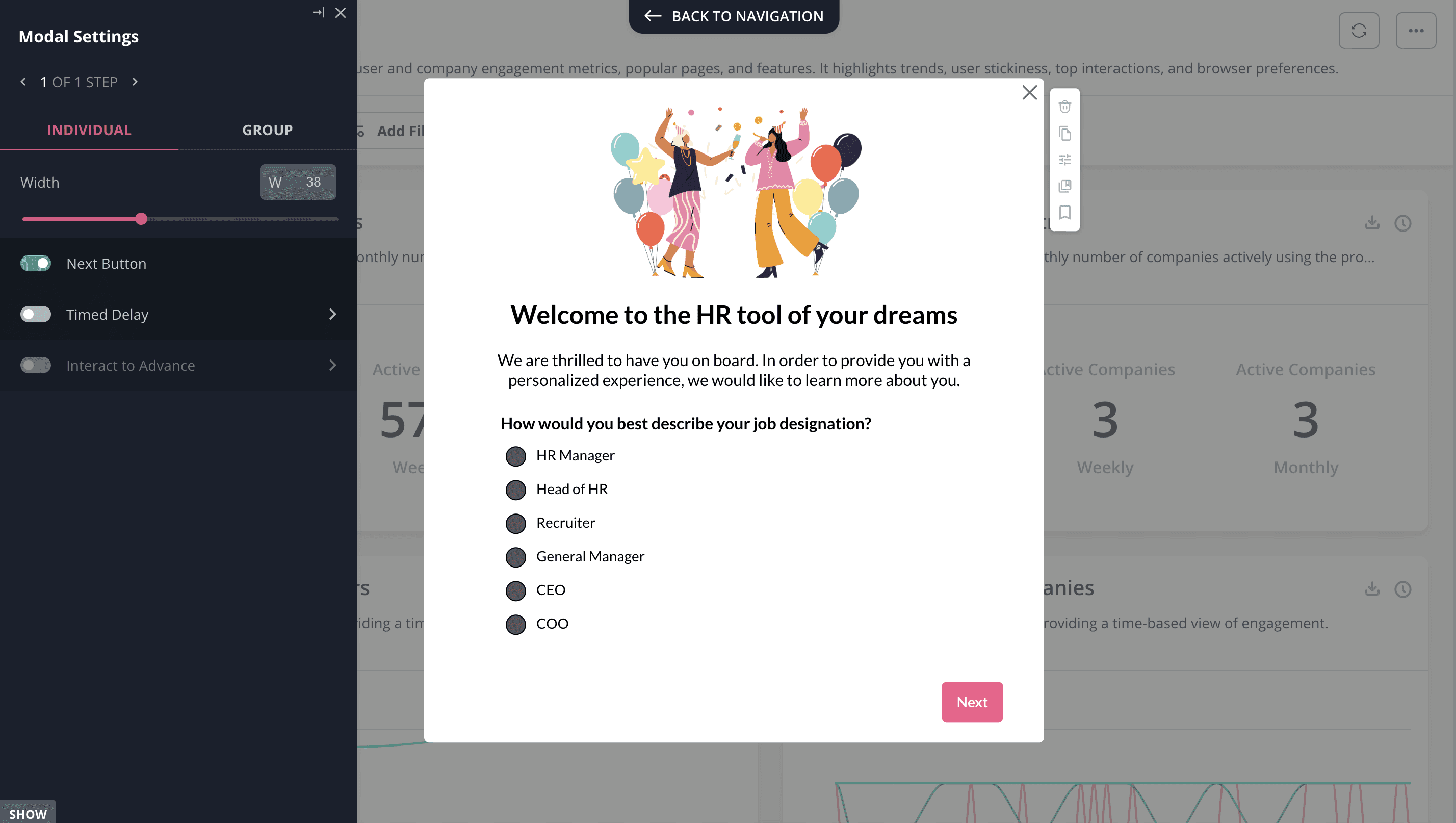
Users often want to know where to go next.
This pattern provides clear navigation options such as returning to the dashboard, viewing details, or editing the action they just completed. It works well when users need to continue working immediately.
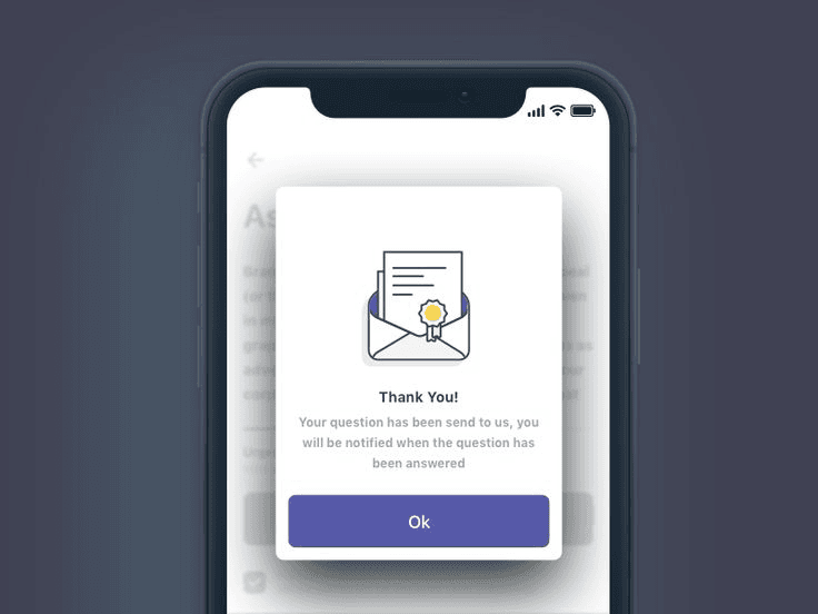
Minimal confirmation screens
Minimal confirmation screens intentionally say very little.
They are useful when the action is low-risk, the user is familiar with the flow, and speed matters more than explanation. This pattern relies on familiarity and should be used carefully.
Common confirmation screen mistakes
Across SaaS products, confirmation screens often fail for the same reasons. They are overly celebratory, packed with unnecessary CTAs, or fail to explain what happens next.
A confirmation screen is not the end of a journey. It is a transition point.
Why confirmation screens matter more than they seem
Confirmation screens shape how users feel immediately after taking action.
Clear, calm confirmations build trust. Vague or cluttered ones create doubt. Over time, these moments affect follow-through, retention, and user confidence. They are small screens, but they carry a lot of weight.
How we think about confirmation screens at Studio Maydit
At Studio Maydit, we treat confirmation screens as part of the product experience, not a finishing touch.
We focus on what the user just did, what they expect to happen next, and what would reduce uncertainty at that moment. The goal is not celebration. It is clarity.
Book a call with us if you want to turn UX into an unfair advantage.
Continue Reading

ChatGPT Is Introducing Ads. Here’s the UX Risk Nobody Is Talking About
As ChatGPT prepares to introduce ads, most conversations focus on revenue and scale. But the bigger question is how monetization reshapes user trust, cognitive flow, and product intent. This Studio Notes piece explores the hidden UX risks product teams should pay close attention to.

Siddarth Ponangi

Why designing for power users too early breaks SaaS products
Many SaaS products become difficult to use not because they lack features, but because they introduce complexity before users are ready for it. Designing for power users too early often feels like progress, but it quietly undermines adoption for everyone else.

Siddarth Ponangi

Why second-use experience matters more than first impressions in SaaS
Many SaaS products spend enormous effort optimizing first impressions. What often gets overlooked is what happens when users come back for the second time, which is usually where real adoption either starts or quietly falls apart.

Siddarth Ponangi

