Why designing for power users too early breaks SaaS products
Many SaaS products become difficult to use not because they lack features, but because they introduce complexity before users are ready for it. Designing for power users too early often feels like progress, but it quietly undermines adoption for everyone else.
Early in a product’s life, there is a strong temptation to design for the most advanced use cases. Power users are vocal, internal teams often resemble them, and complex workflows feel like proof that the product is capable.
In practice, this approach usually backfires.
Most SaaS products are not used by experts on day one. They are adopted gradually by people who are still forming a mental model of what the product does and why it matters. When design decisions prioritize power-user needs too early, the experience becomes harder to enter, harder to understand, and harder to stick with.
How power-user thinking sneaks into early design decisions
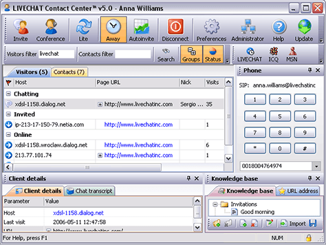
Power-user design often enters quietly. It shows up as advanced settings, flexible workflows, dense dashboards, and edge-case support that feels responsible to include.
These decisions usually come from good intentions. Teams want to avoid future rework and support sophisticated use cases from the start. The issue is not capability. The issue is timing

Why early complexity feels like progress internally
Complexity feels productive because it reflects effort and foresight. More options suggest more power. More controls suggest flexibility.
Internally, these additions feel like progress. Externally, they feel like friction. New users are asked to make decisions they do not yet understand, which slows learning instead of accelerating it.
The mismatch between early users and power users
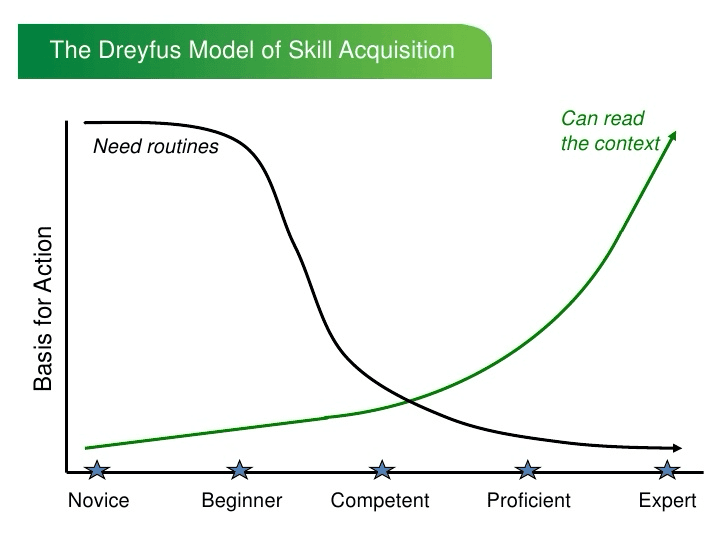
Early users are still learning what the product is for. Power users already know.
Designing for power users assumes context that new users have not built yet. When that assumption is wrong, interfaces become dense, terminology becomes confusing, and onboarding carries too much cognitive load.
The product starts to speak to an audience it does not yet have.

How premature power-user features hurt onboarding
Onboarding works best when it reduces choice and increases clarity. Power-user features do the opposite.
Advanced options introduced too early distract from the core value of the product. Users hesitate, skip steps, or complete actions without understanding their implications. The result is shallow activation without confidence.
Why flexibility too early increases cognitive load
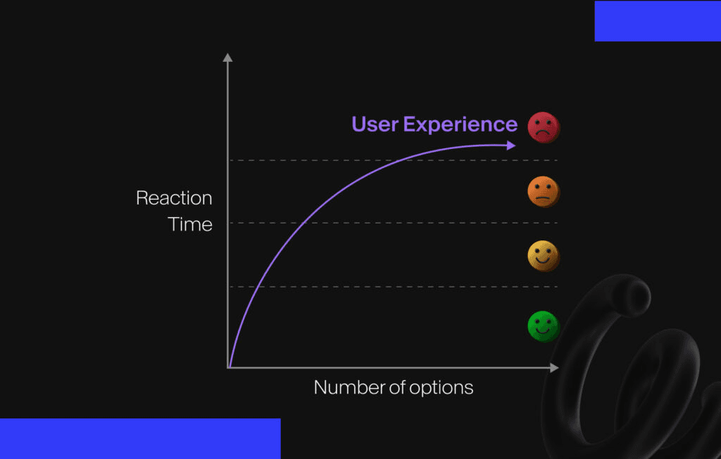
Flexibility is useful once users know what they want to customize. Before that, it creates unnecessary decisions.
When a product offers many ways to do the same thing, new users struggle to identify the right path. Instead of feeling empowered, they feel uncertain. Cognitive load increases at the exact moment it should be minimized.

Progressive exposure as an alternative
A more effective approach is progressive exposure. Instead of hiding capability, products reveal it gradually as users gain context.
This allows beginners to focus on the essential flow while still supporting advanced workflows later. Power-user features become an upgrade to understanding, not a prerequisite for it.
How products can grow power users without alienating beginners
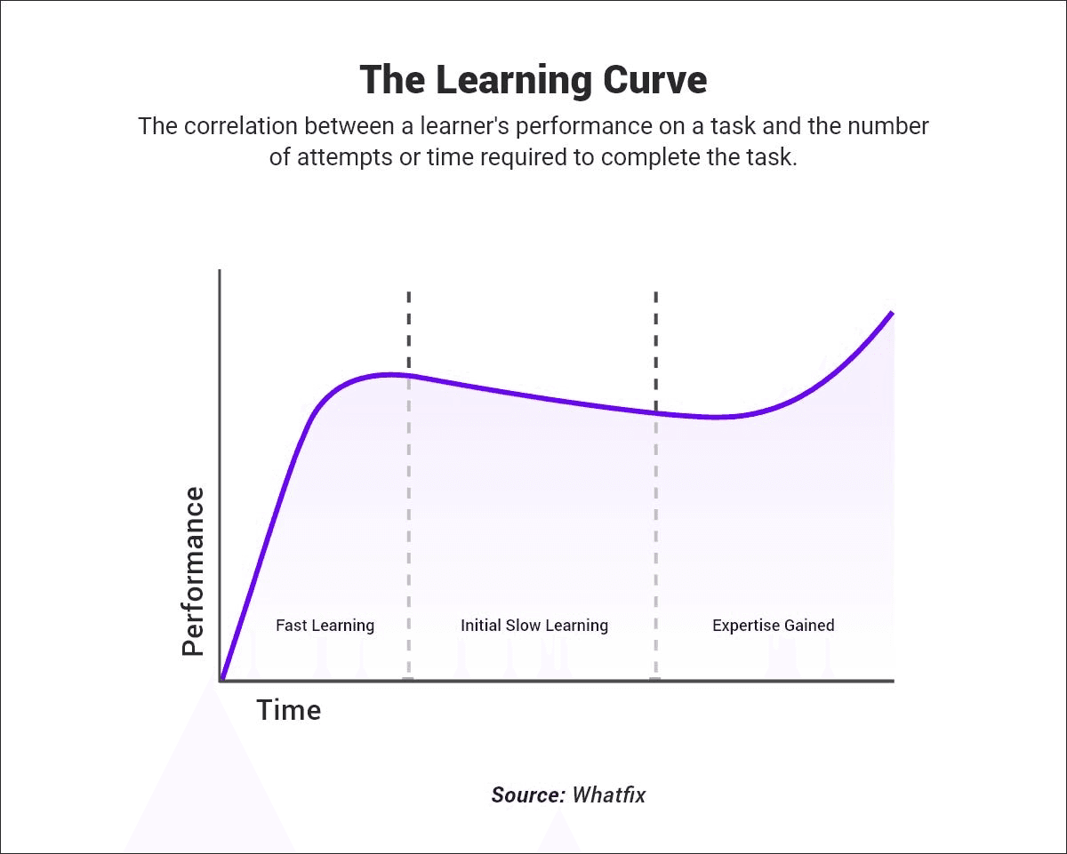
Power users are not created by adding features. They are created by successful progression.
When users understand the core value, build habits, and gain confidence, they naturally seek more control. Designing for that progression ensures that advanced functionality feels earned rather than overwhelming.
Signs your product is designing for power users too early
Common signals include dense dashboards, heavy use of settings, unclear defaults, and onboarding that explains features instead of outcomes.
Another sign is when demos feel impressive, but real usage stalls. This usually indicates that the product is optimized for expertise rather than learning.
What good timing in product design looks like
Good timing respects where the user is, not where the product wants to be.
Early experiences should prioritize clarity, momentum, and confidence. Advanced control should appear when users are ready to benefit from it. This sequencing is what allows products to scale without becoming harder to use.
If your product feels capable but intimidating, it may not be a feature problem. It may be a timing problem.
If you want help designing products that support beginners while still growing into powerful systems, you can book a call with Studio Maydit to design product experiences that scale in capability without sacrificing clarity.

Continue Reading

ChatGPT Is Introducing Ads. Here’s the UX Risk Nobody Is Talking About
As ChatGPT prepares to introduce ads, most conversations focus on revenue and scale. But the bigger question is how monetization reshapes user trust, cognitive flow, and product intent. This Studio Notes piece explores the hidden UX risks product teams should pay close attention to.

Siddarth Ponangi

Why designing for power users too early breaks SaaS products
Many SaaS products become difficult to use not because they lack features, but because they introduce complexity before users are ready for it. Designing for power users too early often feels like progress, but it quietly undermines adoption for everyone else.

Siddarth Ponangi

Why second-use experience matters more than first impressions in SaaS
Many SaaS products spend enormous effort optimizing first impressions. What often gets overlooked is what happens when users come back for the second time, which is usually where real adoption either starts or quietly falls apart.

Siddarth Ponangi

