Your SaaS Website Is Polished. That’s Not Why It’s Not Converting.
Most SaaS websites look finished on the surface. Underneath, they struggle to guide users, build trust, and convert intent into action. After working closely with SaaS founders and product teams, we’ve seen why polish fails and where conversion really comes from.
Dec 29, 2025
Most SaaS founders we speak to say the same thing. Their website looks good, people compliment it, but signups are flat. That sentence usually marks the start of a redesign conversation that does not lead anywhere meaningful.
The reality is simple. A polished website is not the same thing as a converting one. The gap between the two is where growth quietly slows down.

Polish Is Visible. Conversion Is Structural.
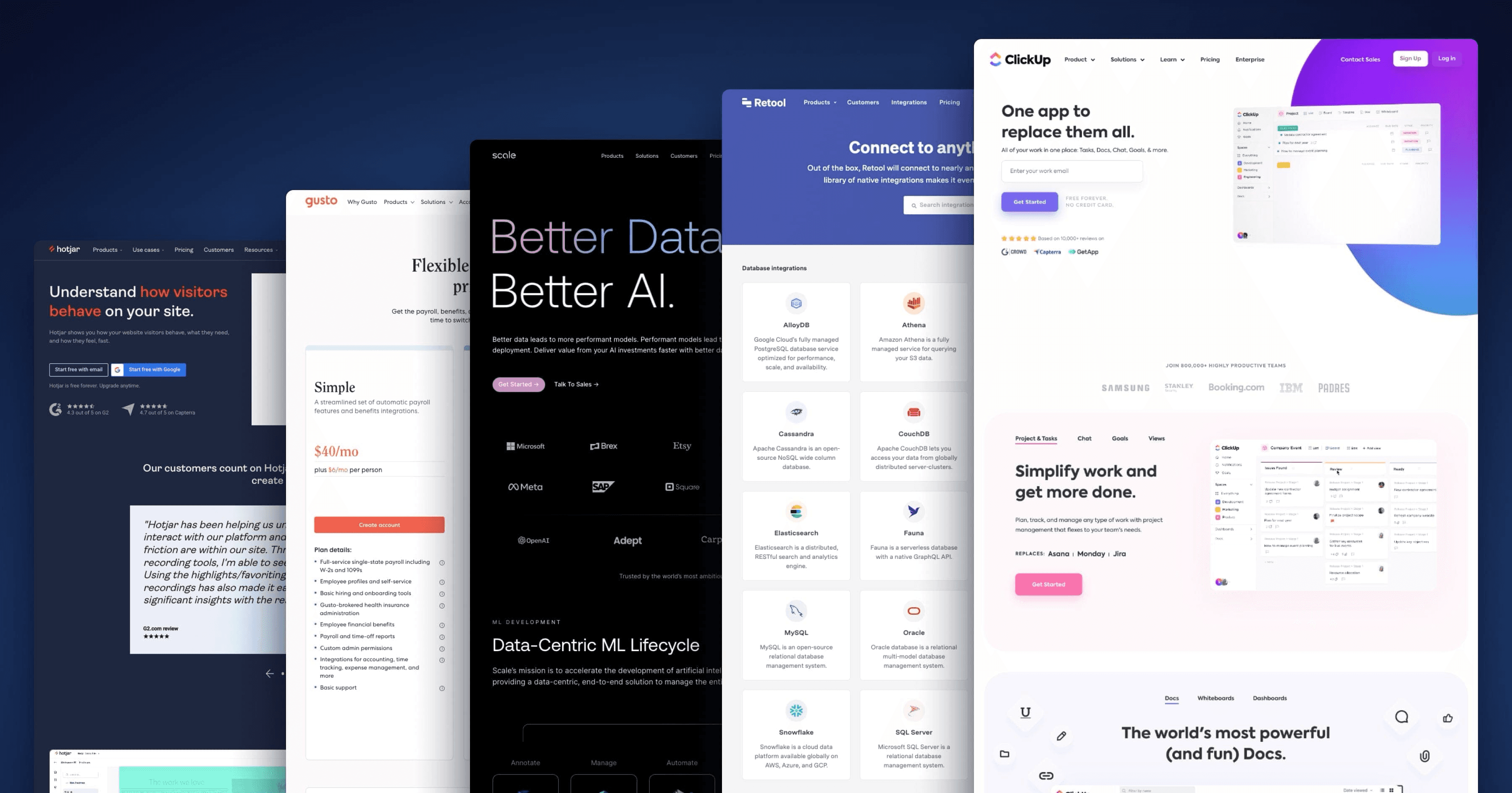
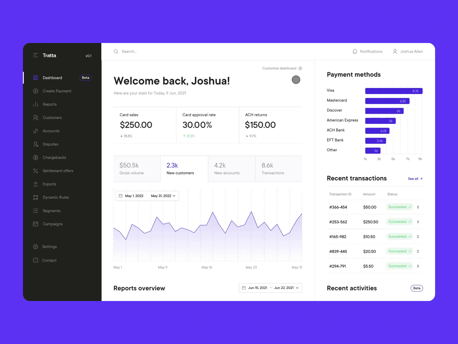
Polish is easy to recognize. Clean visuals, smooth transitions, thoughtful typography. The kind of site that earns praise and screenshots.
Conversion lives deeper. It shows up in how quickly someone understands what the product actually solves, whether trust is established within the first few seconds, if the next step feels obvious instead of confusing, and how clearly the website connects user problems to outcomes.
Most SaaS websites invest heavily in polish and barely touch structure. That is not a design taste issue. It is a strategic one.
Why Good-Looking SaaS Websites Still Underperform
In our experience, conversion issues are rarely caused by bad design. They are caused by misaligned design.
A common pattern is explaining features before value. Founders understand their product deeply, but new users do not. When a homepage leads with features, it assumes context that does not exist yet.
Another issue is visual hierarchy optimized for aesthetics instead of decisions. Everything looks important, so nothing feels directional. Users scroll, admire the work, and leave.
We also see UX decisions made without growth context. Design choices are made to feel modern rather than to reduce friction. Buttons exist, but paths are unclear.
Often the website is treated like a branding exercise. Brand refreshes improve perception but ignore behavior. That is why signups do not move.
Conversion Is Not a Tactic. It Is a System.
High-converting SaaS websites are not aggressive. They are intentional.
They remove unnecessary decisions, guide users through a clear mental model, address doubt before it shows up, and align copy, layout, and flow toward a single outcome.
None of this is flashy. All of it requires discipline. This is where many teams get stuck. Refining visuals feels productive. Real UX work requires questioning assumptions that already feel settled.

When Polish Becomes a Liability
At a certain stage, polish can hide problems. We often see SaaS teams hesitate to change anything because the site looks finished.
Under the surface, drop offs are high, demo requests are inconsistent, activation feels fragile, and sales teams struggle to explain value clearly. The website looks complete, but it is not doing its job. That is usually when growth slows and no single issue can be blamed.
This is where teams feel stuck. They sense friction, but the visuals suggest everything is fine.
What Actually Improves Conversion
Conversion improves when design decisions are tied to behavior rather than taste. That means designing around user intent instead of internal assumptions, prioritizing clarity over cleverness, treating UX as part of the growth system, and making the website work as hard as the product itself.
This is not about copying patterns from other SaaS websites. It is about understanding your product, your users, and the friction between them.

Why This Is Hard to Fix Internally
Most SaaS teams do not lack designers. They lack perspective.
When you are close to the product, everything feels obvious. When you built the system, friction becomes invisible. That is why many redesigns change how things look, but not how they perform. Improving conversion requires stepping back and questioning decisions that already feel familiar.
How We Approach This at Studio Maydit
At Studio Maydit, we work with SaaS companies that are past surface-level problems. They already have a product, users, and design investment. What they need is alignment.
We treat websites and products as growth infrastructure, not marketing assets. Every design decision is tied back to behavior, trust, and momentum. We do not optimize for applause. We optimize for outcomes.
If This Feels Familiar
If you are reading this and thinking that your site looks good but something feels off, that you keep tweaking but results stay the same, or that you need clarity instead of another refresh, this is likely not a visual problem. It is a UX and strategy problem.
If you want a second set of eyes from people who treat design as leverage, we are happy to help you identify where things are breaking and what to fix first.
You can book a call with Studio Maydit, walk us through your product and website, and see if there is a real fit.
If design is meant to be your growth lever, it should actually move the needle.
Continue Reading

ChatGPT Is Introducing Ads. Here’s the UX Risk Nobody Is Talking About
As ChatGPT prepares to introduce ads, most conversations focus on revenue and scale. But the bigger question is how monetization reshapes user trust, cognitive flow, and product intent. This Studio Notes piece explores the hidden UX risks product teams should pay close attention to.

Siddarth Ponangi

Why designing for power users too early breaks SaaS products
Many SaaS products become difficult to use not because they lack features, but because they introduce complexity before users are ready for it. Designing for power users too early often feels like progress, but it quietly undermines adoption for everyone else.

Siddarth Ponangi

Why second-use experience matters more than first impressions in SaaS
Many SaaS products spend enormous effort optimizing first impressions. What often gets overlooked is what happens when users come back for the second time, which is usually where real adoption either starts or quietly falls apart.

Siddarth Ponangi

