
Summarize with AI


Over the past year, a clear pattern has started to emerge across B2B SaaS products. The teams doing well are not chasing visual trends or overhauling interfaces for novelty. They are making quieter, more structural decisions about how their products behave.
Most of these shifts are responses to the same pressure. SaaS products are becoming more complex, users are less patient, and differentiation through features alone is getting harder. Design is increasingly expected to carry more of the cognitive load.
The trends below are not predictions pulled from theory. They reflect what is actually changing in how B2B SaaS products are being designed and shipped going into 2026.
Products designed around flows, not screens
More teams are designing end-to-end flows instead of optimizing individual screens. The focus has shifted to how decisions unfold over time and how context is built gradually.
This reduces cognitive overload and makes products feel easier to use without adding visual noise.
Heights Platform turns this idea into reality with products designed around flows. As an all-in-one AI-powered platform for building online courses and communities, it helps creators easily create natural end-to-end journeys that guide users step by step through content and decisions.
Interfaces that default to progressive disclosure
B2B products are becoming more intentional about what they reveal and when. Advanced options, secondary actions, and edge cases are increasingly hidden until they are relevant.
This helps products serve both new users and power users without overwhelming either group.
Design systems built for speed, not control
Design systems are being simplified. Instead of exhaustive component libraries, teams are prioritizing flexible primitives that enable faster iteration.
The goal is less governance and more momentum, especially as product teams grow.
Fewer empty states, more guided starts
Instead of blank dashboards, products are offering guided entry points that help users take their first meaningful action quickly.
This reflects a shift toward activation-focused design rather than assuming users will explore on their own.
Copy treated as part of the interface
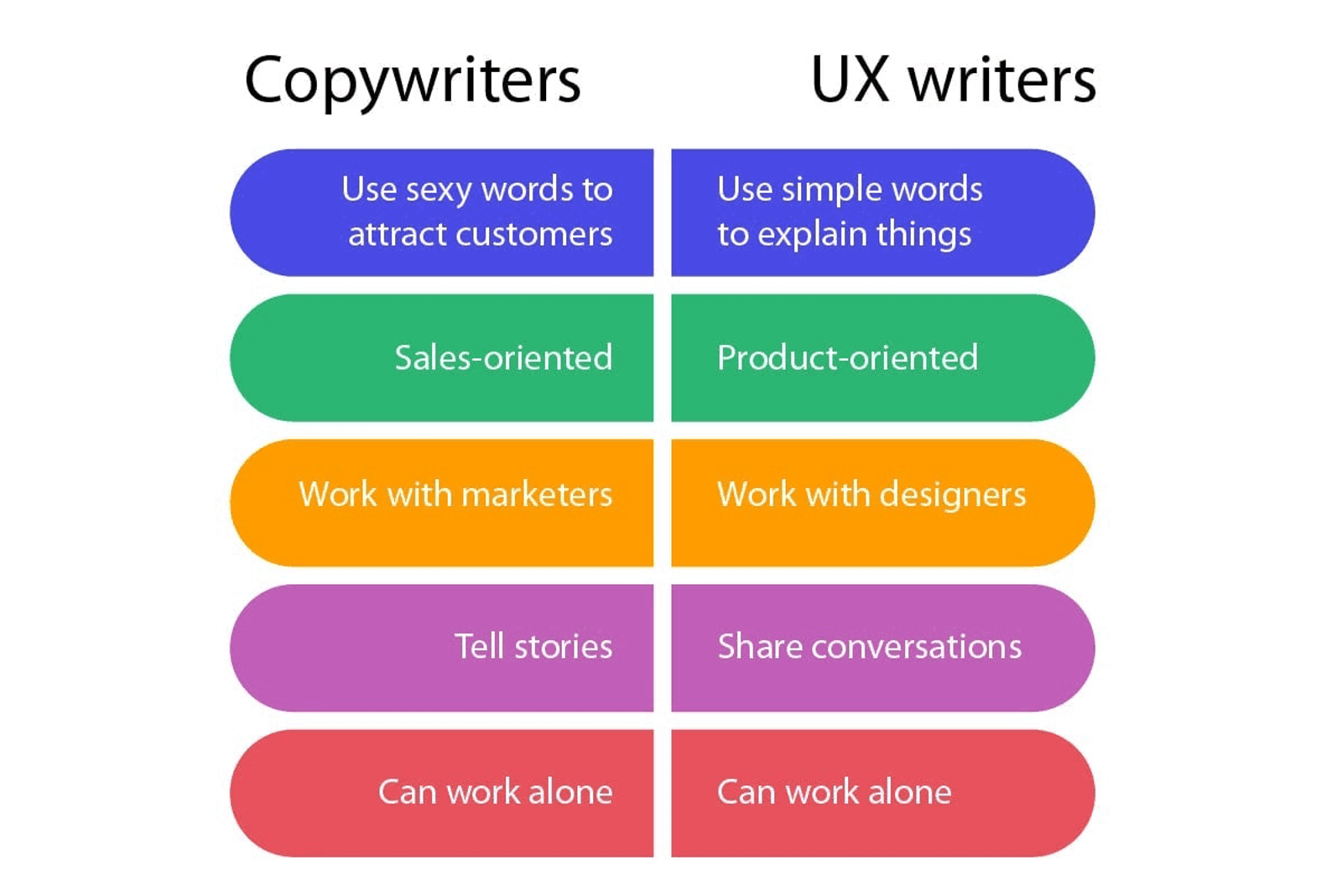
Product copy is no longer an afterthought. Teams are treating language as a core design material that shapes understanding and behavior.
Clear, contextual copy is increasingly doing the work that UI complexity used to compensate for.
More emphasis on system feedback and reassurance
Users want to know what just happened and what will happen next. Products are investing more in clear feedback, confirmation states, and system visibility.
This builds trust, especially in products that handle sensitive data or critical workflows.
Customization without configuration overload
Instead of deep settings panels, products are offering lightweight personalization that adapts over time.
Defaults are smarter, and customization is often implicit rather than explicitly configured.
Design decisions driven by activation, not aesthetics
More teams are measuring design success based on activation and adoption, not visual refinement.
This has led to fewer redesigns and more targeted improvements tied to user behavior.
Products designed to scale clarity, not features
As products grow, teams are becoming more selective about what they add. New features are evaluated based on whether they preserve or erode clarity.
Design plays a key role in maintaining coherence as functionality expands.
Designers operating closer to product strategy
Product designers are increasingly involved earlier in problem definition, not just execution.
This has shifted design’s role from polish to leverage, influencing what gets built as much as how it looks.
None of these trends are flashy, and that is intentional. B2B SaaS design in 2026 is less about standing out visually and more about staying understandable as products grow.
If your product feels harder to use as it scales, it is often a sign that design decisions are lagging behind product complexity. Addressing that gap usually starts with rethinking structure, flows, and priorities rather than refreshing the interface. That is how we approached Syncrodesk, a B2B SaaS workspace where we designed onboarding that tailors the product to each industry and eight CRM modules as one system. If your product is at that point, here is how our product design work runs.
If you want help aligning your product design with where B2B SaaS is heading, you can book a call with Studio Maydit to design systems and flows that scale clarity as your product grows.